Upper Crust Bakery
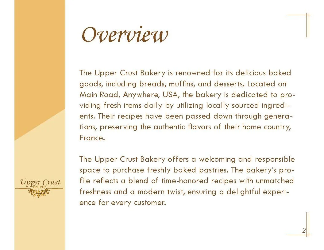
School Project- Upper Crust Bakery is a branding project focused on creating a warm, recognizable identity for a bakery that appeals to a broad audience. The goal was to balance traditional craftsmanship with a modern, approachable feel while maintaining versatility across multiple brand applications


The Challenge
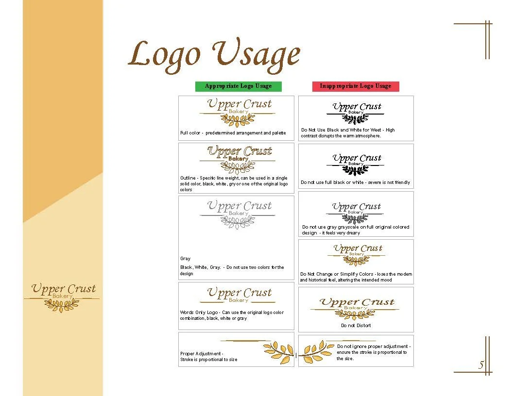
The brand needed to communicate quality, freshness, and trust while remaining relevant to customers of different ages. The identity also needed to function consistently across signage, stationery, packaging, and other marketing materials.
Logo Color Study

Design Solution
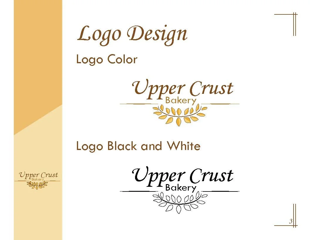
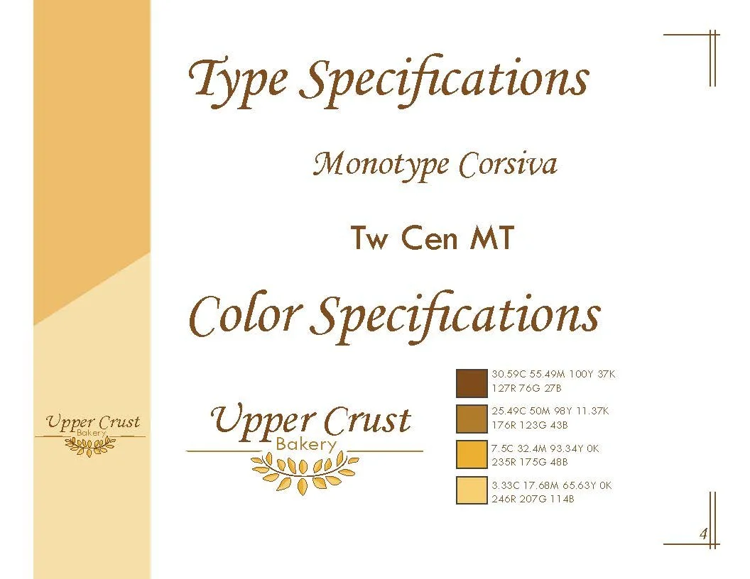
The final logo combines a wheat graphic with a mix of script and sans-serif typography. The wheat symbolizes fresh ingredients and traditional baking, while the typography balances heritage and modernity. A warm palette of browns and golds reinforces feelings of comfort, quality, and familiarity. Careful use of contrast, balance, and hierarchy helps establish a strong visual identity centered around the bakery name.
Final Logo

The Challenge
The brand needed to communicate quality, freshness, and trust while remaining relevant to customers of different ages. The identity also needed to function consistently across signage, stationery, packaging, and other marketing materials.
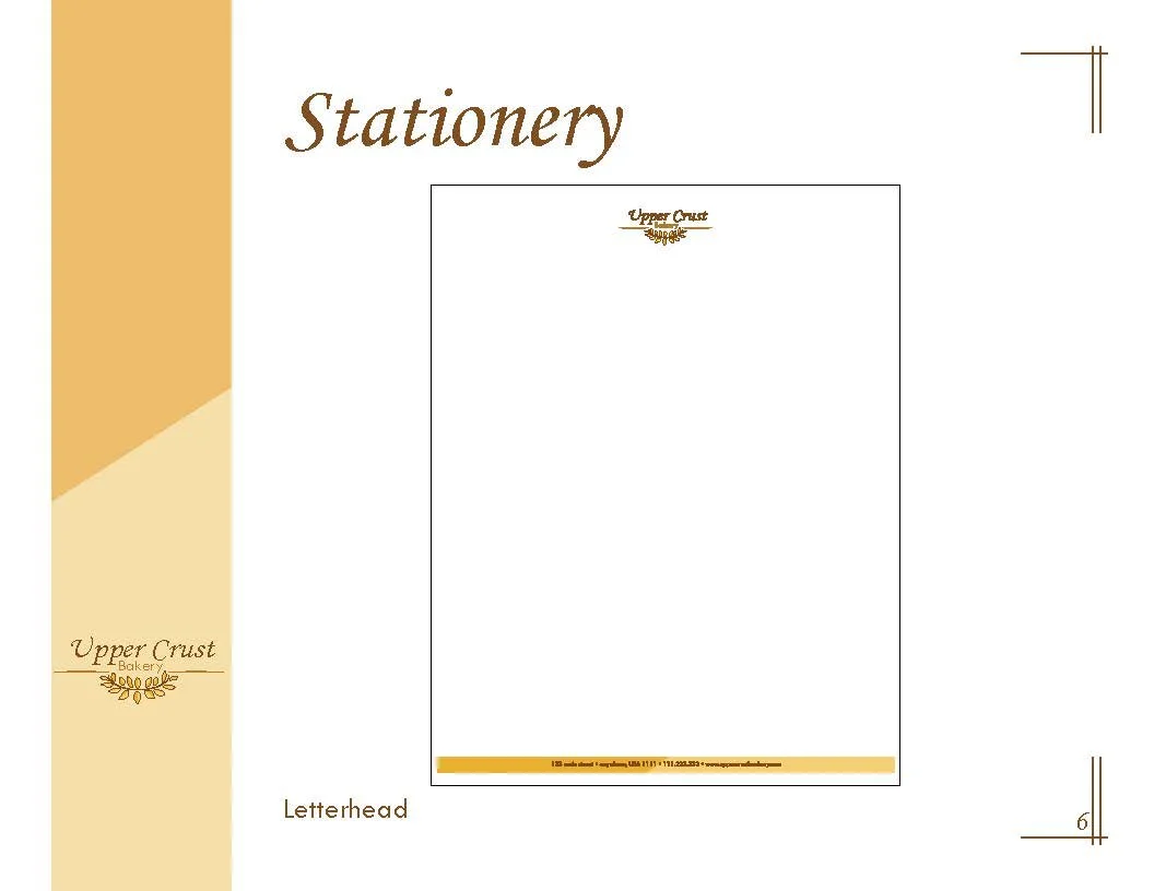
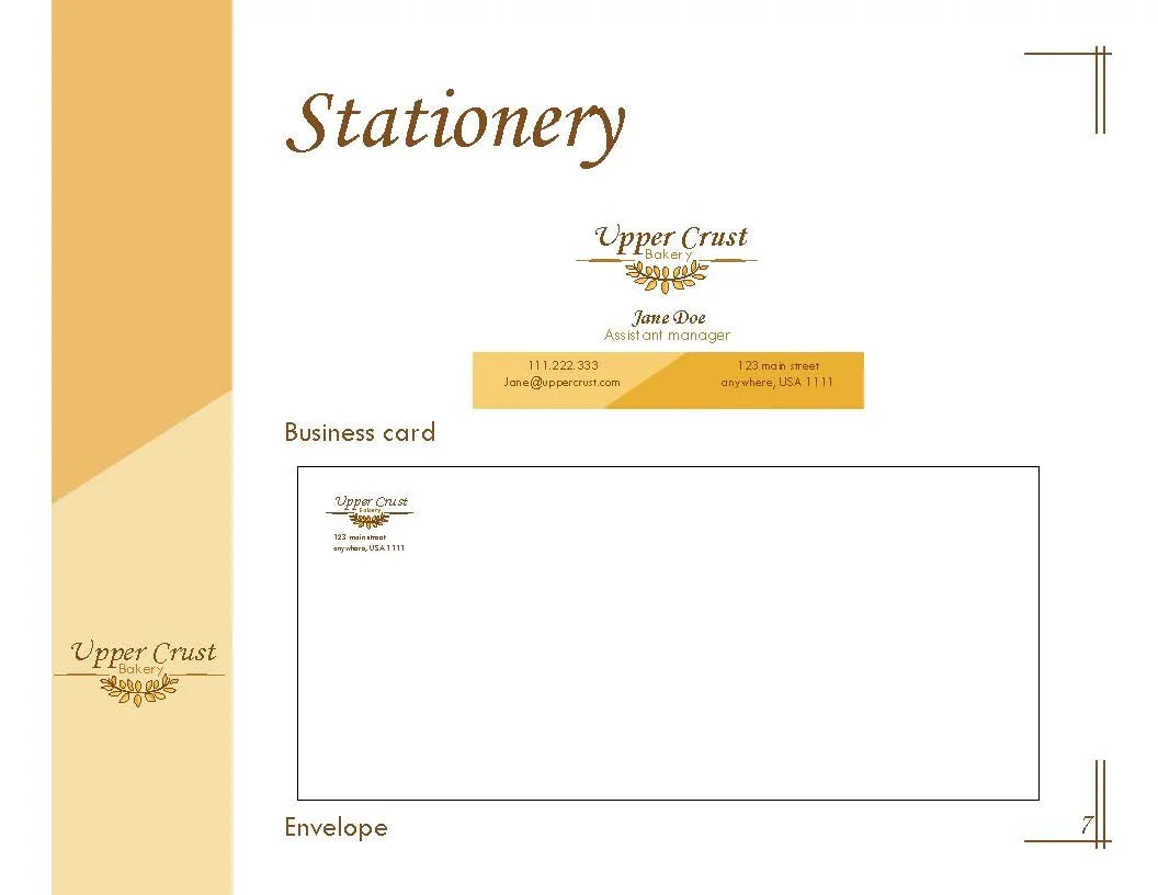
Brand Stationary
Key Takeaways
This project strengthened my understanding of logo development, typography pairing, and brand consistency. It also demonstrated how a visual identity can extend beyond a logo into a complete branding system.